Project Description
Mission Briefing:
![]()
MISSION: To create a website and graphics that kick ass. Kellie Rae came to us in search of a site that would adequately represent her coaching services. It needs to sizzle, have colorful graphics, and represent the essence of who Kellie really is.
NAME: KellieRae.net
AGE: Brand Spanking New
COLORS: Hot Pink and Deep Cobalt Blue
TOPICS: Kickin’ ass and takin’ names
DIFFICULTY LEVEL: Very High
ITEMS REQUESTED:
Drop Downs
Parallax Site
Website Banner
Website Graphics
Website Set Up
Opt Ins
Testimonial Slideshow
Sales Area
High Contrast
SKILLS NEEDED:
Advertising
Artistic
Color Consultation
Contact Form Creation
Digital Painting
Adobe Illustrator
Logo Design
Opt In Implementation and Creation
Photo Manipulation
Typography Layout
Video Embedding
WordPress
Website Layout
Slideshow
Paypal Buttons

Mission Details
![]()
Edgy
Kellie’s updated style needed to be edgy. To accomplish this she needed a modern site, filled with contrast and stunning graphics.
Personalized
Every client is unique and Kellie was no exception. She needed a site that fit her unique style as well as her professional goals.
Colorful
Kellie’s rocker style demanded color and contrast without being in your face glaring. The balance required a few tweakings but the end results are stunning.

Elegant
Despite it’s modern edge she is artistic enough to know she wanted it to remain elegent, both in function and style.
Parallax
Kellie wanted a one page parallax with a design that moved the eye in a zig zag down the page. Later she requested the addition of a blog and contact page.
Functional
Kellie’s site needed to be functional for both herself, and her clients, and to include places for assorted sales materials, bio, information about her branding, as well as other elements.
Mission Solutions
![]()

Graphics

Reconnaissance

Website Design
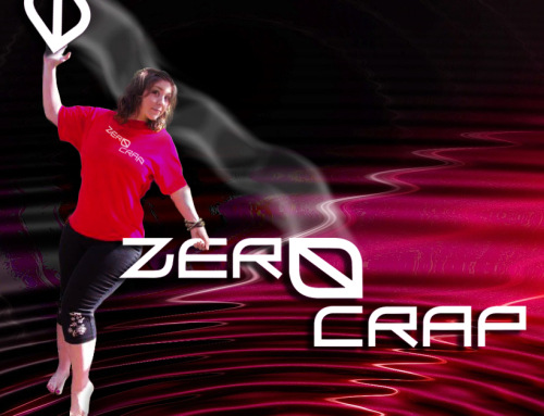
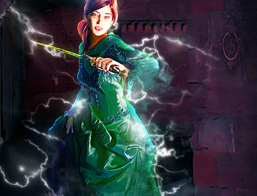
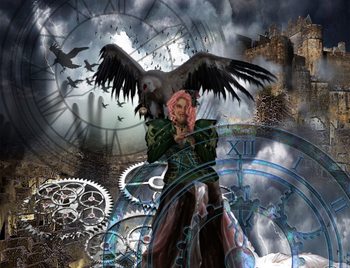
After our first reconnaissance mission we were pretty sure we knew what Kellie wanted. The first piece to be done was to set in place her website and begin adding all the basic elements. Logo came next followed by all the other graphics, drop down boxes, opt ins, blog page, testimonies, quotes and sales buttons. In all it is a high contrast, graphically balanced site with lots of impact. You can see her page at www.KellieRae.net.
Design Samples
![]()


