

MISSION: To create a website and graphics that kick ass. Kellie Rae came to us in search of a site that would adequately represent her coaching services. It needs to sizzle, have colorful graphics, and represent the essence of who Kellie really is.
NAME: KellieRae.net
AGE: Brand Spanking New
COLORS: Pink and Blue
TOPICS: Kickin’ ass and takin’ names
DIFFICULTY LEVEL: Very High
Inspiration: a stunning makeup advertisement that combined both intersting font and a bold contrast of color on black and white
Kellie Rae Stone had already embarked on an online transition away from a very soft nurturing presence to a style that represented her true edginess. Now she needed a site that drew clients who were ready for change. We worked from the ground up creating a visually stunning site from a rather complicated wordpress theme.
 Kellie chose cobalt blue and hot pink as her primary site colors, and it was pure pleasure to have the opportunity to work so freely with color.
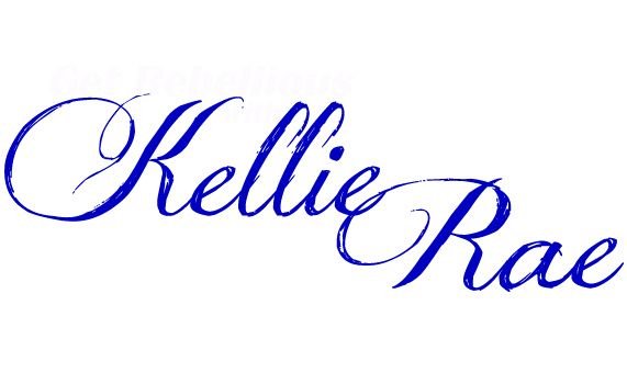
After choosing her colors the first order of business was a new logo. Inspired by graphics we had already created for Kellie’s facebook pages, Mark abandoned the original idea of an interlocking K and R, instead choosing to incorporate Kellie’s face into a graffiti splattered background. It was a lot of fun seeing him create an edgy combo of color and black and white.
Kellie had purchased a font that she felt represented her before we met. While beautiful and trendy, it was a bit tricky getting the script to show up against the multi-color background without introducing another color, but with the use of an outline he managed both legibility and edginess.


Mark’s next job, beyond all the behind the scenes technical stuff, was to create the awesome image featured on the right. Fortunately, Kellie had sent me her pic a while back for a facebook banner, so the work of separating it from the background had already been done. Mark took the already neat image to the next level with some fun special effects.
 The rest of the titles were put together using Kellie’s chosen font and they popped on her dark theme, bringing her close to the advertising that was the original inspiration.
The Quotes:
One of the challenges Kellie faced during this process was producing the intriguing quotes which cover her site. My matching challenge was aligning them so that they looked great on a parallax background. We played around with splashes of color behind the quotes but eventually decided that the color was competing with Kellie’s other graphics and cluttering up the design. Her first quote inspired our font choice for the quotes.

Adding video to Kellie’s site proved to be an unexpected challenge. In the end we opted to use a youtube plugin rather than hard code the videos. Although the theme came with several sliders, none of the sliders were fully enabled. Eventually Kellie can opt to purchase the full version of the plugin, which will give her the ability to show off her youtube channel right on her website.
The Doors:
Kellie Rae requested the use of doorways so I incorporated them into each of her sites menu items. Using wonderfully crisp images, gleaned from a professional photoshoot, we transported Kellie to exotic and colorful sites. The images were already strong, thanks to her natural aptitude for modeling and the amazing photographer who captured the kickass attitude, but they didn’t fit Kellie’s theme of journey or her color scheme. My job was to bring all the elements together into a smooth flowing graphic experience.
The Advertising:
We next transformed a couple of images for advertising her coaching packages. While my alteration was a simple color and intensity shift, Mark’s required a lot more work due to the black and white image we started with. The results? See for yourself.

Testimonials:
To finish up the front page we added the testimonial area. For this I created a guitar template that aligned with a concept of voices being like thunder and lightening. Featured here is Pam Randolph, aka Fireball, Owner/Coach of The Phoenix Flight School.

Opt Ins:
After setting up her blog page, paring away all the extra junk until she had a nice clean format, we did our final work and added her opt in and contact sheet.

In all this was one of the more difficult projects we’ve worked on. But the results are truly a delight to behold.

Be sure to check out her site so that you can see the graphics in place.We look forward to more projects with Kellie. www.KellieRae.net
 About Kellie Rae

“I make no excuses for my diverse roles as a Rock Your Feminine Type Coach™ and Branding Expert, best-selling author, and crime thriller novelist. Yes, I do chuckle a bit at the irony. I kick ass as a women’s biz transformer for badass rebels by day and kill off vulnerable fiction characters at night. What the hell, it makes for some interesting dreams!
I believe that every woman should pursue her red hot passions no matter how out there they seem to be. One of those pure heart-fluttering passions for me has always been writing. Since I did, indeed, chase my dream of being a writer, I’ve published two non-fiction books in the self-development genre, co-authored an international best seller, and now, I’m finally pushing my much-too-old-to-be-in-the-nest novel over the edge. My whole world is one helluva lightning display, and I adore showing others how to live life unfiltered, whether I do that through the written word or my “Ignite Your Ass” Coaching. I love my job!”
~Kellie “Ignite Your Ass” Rae
