Project Description
MISSION: Target and eliminate the former flower image, which was posing as a cover, and replace it with a female vampire.NAME: Cassandra
AGE: Forever-Young Vampire
EYE COLOR: Green
HAIR COLOR: Red
WEAPON: Sword
GENRE: Fantasy Fiction – Sci-fi
DIFFICULTY LEVEL: High
In early 2015 J.E. Feldman posted a picture of a cover on facebook and asked the general public for advice on which flower image she should use for the next book in the series.
Based on the image from her first book in the series (see below), a pale rose on pastel background, I assumed the books to be in the romance genre and gave my recommendations. Her two images, while vibrant, did not have the almost watercolor feel of the first cover so I recommended softening the image and dropping it onto a pale background. I also posted a quick mockup of how the images could be adjusted so that they looked like a series.
Reconnaissance:
J.E. later contacted me and asked if I wanted to design the covers. It sounded like a fun task and I accepted. During the reconnaissance stage of the mission, I discovered that the book was not a romance and recommended that she switch the covers to something which more accurately represented the fantasy fiction genre. She immediately agreed and we shifted the goal to just one cover. While reading her story I was excited to discover her use of a transporter. I felt this set her apart from most fantasy fiction stories. I recommended that we do an action pose of a vampire, along with a transporter, and a castle.
Cassandra the Vampire:
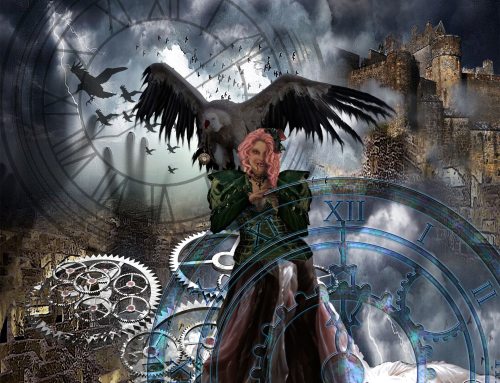
She agreed and I set to work on the first challenge, creating Cassandra. Fortunately we had run a test photoshoot the month before, so I owned images of my daughter, Amber Tilton, wearing a gown. They were not the best of quality because it was just a test to see if I was happy with the equipment, but we did not need perfection, as I knew that the images would be overpainted and have special effects. As you can see I’ve isolated her from the background, her gown has been altered to green, eyes altered, and teeth added. I also added to her hair.
 The Transporter:
Warning: the next part may spoil the magic for some people.
We needed a transporter, black with blue lights. The transporter was created from a photo I took of my shower head. After adding feet and special effects to it, plus changing any element I didn’t like we had the transporter. If you want to recreate something similar I recommend canstock photo.
With the two principle items in place all we needed was the background. I quickly decided that it would require reducing Cassandra too small to do an interior room. After choosing several castle images I opted for a close-up of the entrance to a castle and threw together my first mockup for the cover. I didn’t bother using the green gowned Cassandra for the mockup as I was just concerned about placement and choosing the right special effects for the transporter. All kinds of ideas went through my head during this stage. Star Trek, ufos beaming people up, etc. You can see at left the early stage mockup, it was not a pretty thing. The twisting water, while a cool effect, wasn’t working for me. And the Star Trek effect made the image too difficult to see. But the layout was good and I moved forward with the small details.
Special Effects:
I then went on to create a very bright image using lightening and flares. Finally I felt I was narrowing in on something interesting. But after talking with J. E. Feldman, I decided it needed to be darker in order to suite the current trends in the adult books. It did, however, give me an image that I could send to her for element placement checj. She was delighted with the direction and I moved onto the tricky part.
The gown was added to in order to move it away from modern and towards a more archaic look. Once I was satisfied with that I began the special effects. I wanted to add a dispersion and dissolve element to the image as well as the lightening. Applying one special effect to an image is not really difficult, two is tricky, three can be a nightmare. Most of the information on the market will recommend that you rasterize your effects before adding another one. However that would have added too many highlights and other distortions so I was forced to keep all three special effects open at once while I adjusted them.
The Typography:
I love fonts but they are not my specialty, after laying out the design with title, subheading, and author name in place I consulted with Mark. He recommended some adjustments and the image went off to J.E. Feldman. She sent back a request to change the Title to Cassandra and was concerned with the size of the subtitle. I created these three images and sent them to her as a final choice before finishing the cover.
She preferred 2 or 3 but wanted the lightening from one at the bottom. She was also concerned with how close the flares was to her name and did not want the lightening going over her face. Although I was disapointed with the choice to reduce the lightening on her head I totally agreed about her name needing to be defined. As you can see from the final image all her requests were fulfilled. And some other elements were added in order to integrate the side panel and back cover with the front cover.
All in all this was a pretty difficult mission because it involved 4 special effects and every adjustment to the design resulted in modifications to hundreds of layers. J. E. Feldman was a pure pleasure to work with and has remained a staunch supporter of our work. Mark Hardman was consulted throughout the entire process for design decisions.
